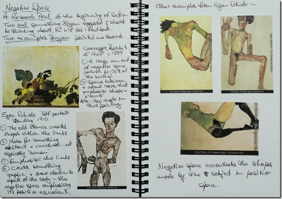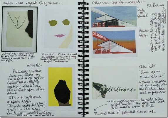
A prompt to think about negative space was part of the feedback on my first assignment; and it comes up as a research point at this stage in the module. Beginning with two specific directions from the assignment feedback, I am summarising here the examples and annotation illustrated from my sketchbook. Bryan raised two examples, firstly the Caravaggio still life, ‘Basket of Fruit’, top left above. There is a considerable amount of negative space used in the composition, maybe 60-70% of the surface of the picture. It contrasts with and emphasises the overall shape of the main subject matter and, partly because of the choice of colour, particularly draws attention to the smaller spaces between and around the fruit and leaves. (I also note the unusually low angle from which this has been painted, which combines with the large negative space to produce, I think, a kind of flatness and neutrality about our view, which reduces the depth, like a photograph with long focal length – no sense of how far away that yellowish background might be, for example. Which, potentially opens up questions about painters’ use of camera obscura projections … perhaps more of that later.) The lower picture on that page is an Egon Schiele Self Portrait, which Bryan also mentioned. Schiele has positioned the figure’s arms in this odd, angular stance, which creates negative space that would not have been there in a more conventional pose. It seems to make something abstract and not typically ‘human’; emphasises the limbs and creates something ‘graphic’. There are more examples, on the right hand page, of the way he does this in figurative work.

The module notes on this topic suggest looking at Gary Hume – there are three examples of his work on the left page above. In the first, top left, a piece of black perspex placed over a very simple line drawing creates the outline of the woman’s body. The second, top right, titled ‘Funny Girl’, is almost entirely negative space, with the pale, fluid shape on the right (hair, or a hand to the side of the face?) creating the profile. There are actually some pale hair-like marks at the top of the frame and the odd green ‘eye’ shapes have something almost bird-like about them. The third Hume picture is titled ‘Yellow Hair’, which gives a clue that the apparently negative space that makes up most of the image is, perhaps, the positive space, the subject of the drawing, with the blank, black ‘face’ becoming the negative. So he seems to play with the idea of positive and negative – but it also seems to me that this is moving towards graphic design. Ed Ruscha’s ‘Study for Standard’, top right, uses the vast blue sky in all of the upper right portion of the picture and between elements of the main subject matter. Once again, it seems to have an abstract quality but is also contributing to the exaggerated sense of perspective. In the ‘Standard Station’ picture below it, the colour has been partially changed, adding to the drama, but the huge amount of negative space has the same graphic effect. In some senses, Colin Self’s ‘Guard Dog on a Missile Base No 1’, below the Ruscha, has a similar composition to the ‘Standard’ pictures, with a sense of perspective in the receding missiles and the foregrounded dog; but the huge white negative space is also the space into which these missiles would be fired – a kind of implied line of movement.

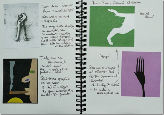
Jim Dine’s drawing of a wrench (above, top left, from a series ‘Ten Winter Tools’) contrasts with the previous graphic images but also uses negative space in a significant manner. The very dark shading around the subject not only emphasises shape but also seems to lift the form of the wrench off the background. The Jordy van den Nieuwendijk picture, bottom left, titled ‘Sunset Cigar’ is also from a series – oil pastel drawings on wood – and is a very recent piece. The dominant black space is emphasising shape again, but is also contributing significantly – black = night – to the context. And two more recent pieces, on the right hand page, from Israeli artist/designer, Noma Bar, playfully pare down everything to a very minimal, graphic representation. Particularly in the lower picture, entitled ‘Hunger’; the simplicity/humour is combined with a more serious point, as the fork is converted to a hand, reaching out.
Summarising on ‘negative space’:
- Be aware of it and its significance/usefulness.
- It is particularly effective in emphasising shape in the subject matter and spaces within/between subjects.
- It can create strong design elements in the picture – abstract shapes; perspective; implied lines/direction, for example.
- Beyond shape, it can even emphasise form.
- And it can have signification properties e.g. choice of colour.
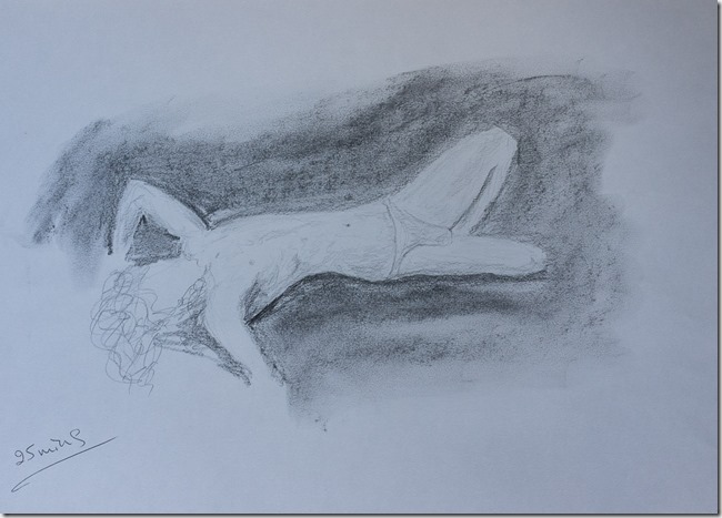
And finally, a little something of my own, from pre-Christmas, inspired by the research of negative space.
