William Kentridge–’Thick Time’ and more

Kentridge 6 drawing lessons

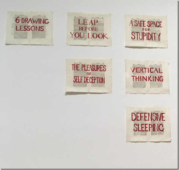
‘Thick Time’ is the title of William Kentridge’s exhibition that has just closed at the Whitworth Gallery, Manchester; and to which I returned, for a second visit, a few days ago. The exhibition guide quotes Kentridge as saying that he is interested in ‘political art’, a term that the quote instantly qualifies “… that is to say an art of ambiguity, contradiction, uncompleted gestures and uncertain endings”. I’m not sure that would be most people’s instant definition of ‘political’ but it has all the more significant ring to it for that very reason. ‘Six Drawing Lessons’ was the title given to a series of (six) lectures Kentridge delivered at Harvard in 2012 but, as this partial image (above) of a wall at the Whitworth suggests, don’t go looking for the six secrets of successful drawing – or anything else so determinate. Kentridge deals in the incompleteness, uncertainty and ambiguity of human life – but on a monumental, multi-media, multi-sensory and sometimes almost overwhelming scale. He does not seek to pin anything down and I wouldn’t attempt to do that with the work, either. This post is about some important things that I have taken from the experience of Kentridge’s work and which have inspirational and informative potential for the final part of my Drawing Skills studies.

He draws. Drawing is at the heart of what he does – both literally, in the process of making the work, and ‘philosophically’ in the way that he thinks about the process (as in this excerpt from the Harvard Lectures – here). He draws in charcoal, sometimes ink, sometimes (as in the video clip) with shards and fragments that flow freely until combining into a recognisable form. And so there is inspiration in the notion that, essentially, an internationally acclaimed artist such as he, essentially, again, draws.

He is playful. The work is serious, intense, significant and deep; but there is something playful about Kentridge, behind the rather dour-looking, portly, sixty-plus figure that he presents (and through which he is ever-present in his work). The studio-based, filmic pieces in ‘7 Fragments for Georges Méliès’ demonstrate that aspect of his creative process, for example this. I might have begun this paragraph with ‘he entertains’, because I think he does. ‘The Refusal of Time’, for example, a 30 minute, five screen video projection that fills three walls of a room as well as presenting a huge, moving, wooden sculptural installation in the middle of the floor, is concerned with “… relativity, string theory and black holes, as well as the turbulent history of industry and colonisation” (Exhibition Guide) – a conceptual ambition matched by the overall scale, one might say. But it has a lightness to it, a sense of whimsical humour at times – not least in Kentridge’s own persistent presence. For me, ‘good art’ (Winking smile) draws us in at what might seem, as ‘entertainment’ or whimsy, a superficial level; but once we’re there, we are rewarded and challenged by the potential of what we find (which leads into the next point).

His art is open-ended and non-directive. I’m repeating myself, to an extent – this is the point being made by Kentridge himself through the quotes in my opening paragraph. It’s not so much, for me, that the work poses questions; more that, like life, it presents a flow of experiences from which we make what we can. And we’ll never fully comprehend it all; nor should we expect to. It is art to be experienced.

He animates. This is more of a ‘formal’ response, but a potentially important one for me as I take my drawing forward. The basis of Kentridge’s work is, as I’ve said, ‘drawing’, but so much of the process and presentation is ‘animation’. What has been still appears to move and, through the movement, our experiences and our reading of the work also moves, to a new level. I suppose, and this takes me into a more complex theoretical area that I don’t intend to develop in this post, that the movement increases the likelihood that we are tempted to read narrative into what we are watching. I am looking at some theoretical writing on experimental animation, to which I’ll return later, and one of the characteristics identified is that it doesn’t, typically, feature “… causally linked events which occur in a defined time and space …” (Paul Taberham; ‘It’s alive if you are – defining experimental animation’, in Experimental Animation: from analogue to digital). So, Kentridge’s animation is not setting out to tell us a story, but the movement adds another formal, experiential level to the work – non-linear, non-directive, of course, but another aspect of the ‘drawing in’. The process aspect of his animation has also interested me. He describes it here. Interesting that his films develop without too much of a pre-conceived direction – no storyboard, he says. And the process of making the animation that is illustrated in the film has a kind of meditative aspect to it. It’s a slow, laborious, and in this case, non-digital process of building something as he goes along, thinking as he goes.

This latter idea is something that I have particularly latched onto from looking at Kentridge. I like the idea of adding a level of animation to my drawing; and I am interested, too, in the way this can add another creative process into this digital/physical interface, the space in which I am keen to ‘play’. I’ve begun with a small digital experiment: Animation experiment. It is an experiment, not a work of art Smile!

And then back to William Kentridge; as is clear from what I’ve written here, the Thick Time exhibition and my supportive reading and research have proved inspirational and informative of some potential ways forward with my work. Animation, in particular, has caught my imagination and I am going to explore its application to the project based on William Hoole’s old exercise book. In fact, and finally, here is another positive from the Kentridge work – he makes extensive use of books, usually old books, and particularly, in his case, as the ground for his drawing and subsequent animation. It has proved to be a very positive encounter.

Monochrome

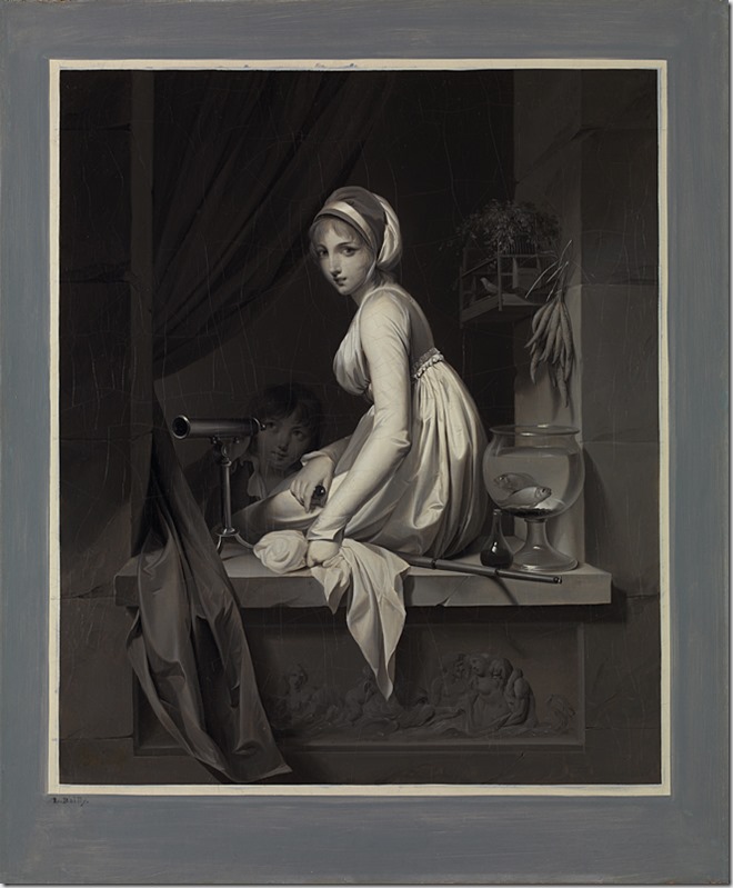
A Girl at a Window

Louis-Léopold Boilly (1761-1845) A Girl at a Window, after 1799 Oil on canvas, 55.2 x 45.7 cm The National Gallery, London

On a visit to the National Gallery, back in late October, I was stopped in my tracks by this small painting. It stood out in marked contrast to the array of vast and vibrant colour exhibits around it – and, genuinely, my initial reaction was that it was a black and white photographic print of a painting that had, perhaps, been removed from the gallery. It isn’t. It’s an oil painting. And that blue-grey surround that looks like a mount is part of the painting. It’s an example of grisaille – painting in monochrome shades of grey. It clearly alludes to the act of looking – note the number of optical instruments in the composition and the subject who is, without doubt, returning our gaze. The skilful representation of the tonal gradations is, as I’ve suggested, reminiscent of a photographic print; it could almost be a 21st century photo-realist painting. It is, of course, more than likely that Boilly had never seen a photographic print when he produced it – certainly if we assume that it was reasonably close to the “… after 1799” date attributed to the work, he couldn’t have. In fact, according to an exhibition catalogue to which I’ll return shortly, it is actually a very deliberate illusion of a print – an imitation of a ‘mezzotint’. So, in that respect, it is exactly like the 21st century photo-realist paintings – confusing our eyes and prompting us to think about how we look at images of the real; about painting, printing, and the reproduction of images; and about how we respond to these various forms. (It is also, probably, a painter’s deliberate demonstration of the potential of his skills and medium above all other methods of representation.) Whatever – it’s very, very striking and it certainly stopped me in my tracks.

In the gallery book shop, I came upon Monochrome: Painting in Black and White , the catalogue for an exhibition 2017/18, at the National Gallery, that I wish I had seen; and, sure enough, the Boilly is featured. The essays in the book (which, by the way, has only just come into my possession), by joint curators, Lelia Parker and Jennifer Sliwka, describe monochrome painting as a thread through the history and practice of art, a story of connection between painting and other art forms – sculpture, printmaking, photography and film – and of their impact on painting. Notably – there is no reference there to drawing, which says something! Monochrome painting, we’re told, has often been used to demonstrate painting’s superiority; a demonstration of the intellectual power of painting. (And, presumably, the same might be said of drawing.) Colour can be seen as a distraction from the techniques of conveying form and texture.

Historically, the catalogue traces examples of black & white painting from 5thC BC Greece; through references by Pliny the Elder c 50 AD; Renaissance Italy; Cistercian monasteries; grisaille in France; Malevich’s Black Square; Picasso; Albers; Pollock; and Gerhardt Richter. But why? Why paint in black and white? The book explores the following in depth:

  • religious austerity – relating to, for example, abstinence and penitence;
  • historical distinction – where, for example, Old Testament events appear in a black and white border around a colour representation of New Testament events (which I find interesting in the context of our own, more recent, historical perceptions influenced by black and white films and photographs);
  • preparatory works – for example, studies of drapery;
  • independent demonstrations of skill and ingenuity – painting in black and white to ‘show off’, you might say (thoughts of modernist photography spring to mind!);
  • imitation of other media – sculptural reliefs, for example, plus printmaking and photography; often deception of the eye is the subject as much as any figurative or narrative intent;
  • abstraction – contemplative; simplicity; spirituality; reduction to basics – Richter refers to the “quietness” of grey.

Quoting directly from the book (page 23):

“Painting in monochrome has endured precisely because it allows painters to test the limits of their discipline … It enables them … to challenge viewers to reconsider their perception of the world around them.”

Reflecting on what I take from this:

  • I note the media specificity and the implied ‘competition’ between different media. Contemporary thinking might challenge the usefulness of such an apparently ‘competitive’ approach but it can stimulate creativity and certainly can be a basis for pushing the boundaries. In my degree work, I eventually abstracted away from the purely photographic and now find myself exploring the possibilities of drawing. In both cases, the process of making and pushing opens up new forms that evoke significance.
  • I was certainly drawn, strongly, towards the Boilly; and it pleases me to think of this 18/19 century French painter contemplating the way he and his viewers look at prints and paintings in much the same way that we have, later, looked at the photographic image – shades of Walter Benjamin. Mostly, it emphasises the enduring importance of, and consequent interest in, the visual image and our response to it.
  • My own drawing has, latterly, focused on the monochromatic. There is intention – developing skills by limiting means; some exploration of the ‘trompe l’oeil’; representation of form and texture – but it is an interesting contrast with where I went, photographically. With (if I’m being honest) a perception of black and white as having ‘historical’ connotations, as being outmoded, as having potential for pretentiousness, as having associations with the modernist practitioners, I resisted its use in anything other than deliberately imitative contexts.

So I find myself wandering in this monochromatic world, currently captivated by what can be done just with pencil and pen – as have all these others through art history (albeit they seem to have needed to work with paint brush and oils to feel sufficiently superior … just kidding, honest!). Though I don’t think the digital/colourful world has gone away, by any means; perhaps it’s reflective of mood.

Josef Beuys

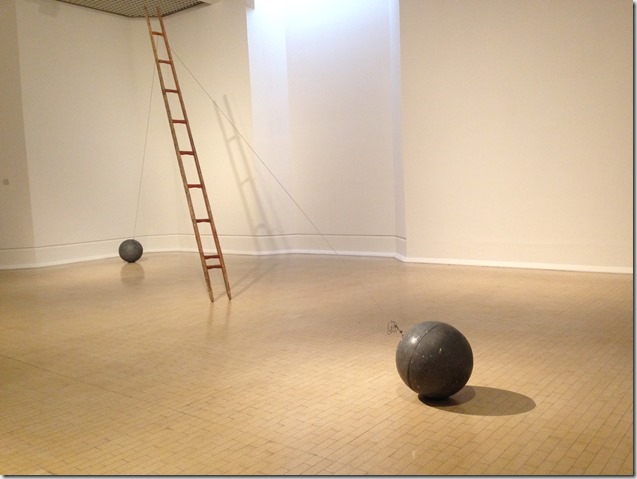
Scala Napoletana

Scala Napoletana, 1985, Josef Beuys (Leeds Art Gallery 2017)

Last weekend I was fortunate enough to spend a few hours at Leeds Art Gallery on a study visit with my tutor, Bryan, and several fellow students. The main purpose was to view/discuss the exhibition of work by German 20thC artist, Josef Beuys. I had, briefly, seen the exhibition before, but subsequent reading and then, especially, the introduction and conversation last Saturday, have all added significant layers. The outcome has not been to make me keen to look further at Beuys and his work, but there is much to be gained from the ‘looking’ that I’ve already done and subsequent reflection.

Beuys is a significant figure in Post WWII European art. In sculpture, his influence has been particularly notable in the choice/use of materials – notably felt and fat – and in the notion of sculpture as ‘not fixed’, not ‘finished’, ‘changing’ – fat being particularly prone, of course. He is also well-known for his performance art e.g. I like America and America likes me, 1974, wherein he spent three days in a gallery room with a coyote.

The Leeds show primarily involves sculpture, with the predominant materials being felt, fat, wood and rusting metal. One, perhaps inevitably, outcome is what I can best describe as low-key visual impact and appeal. That’s perfectly fine, of course, nothing says art must have immediate visual appeal; but it can make it that bit harder to respond and can mean that, without substantial time and research, the significance takes some appreciating. I suspect that, when looking at this work (as with much conceptual art), the more you search for meaning the less you get from it – but the more you understand of its background, the better placed you are to appreciate its presence. So, Beuys’ sculptural work perhaps asks us to make an effort.

I probably spent the longest time in front of two Untitled vitrines, placed side-by-side; one with wood/metal/felt objects/shapes e.g. a section of railway line, a hammer, some cut felt; and the other with fat in various forms and containers. Just experiencing the contrast between the two and also sensing some relationship with the ‘real world’ where these materials have their functional existence has thought-provoking potential. But the visual reward is limited, for me, and I have not felt (!!) a desire to look further.

One exception, for visual appeal, would be the piece illustrated at the top of this post, which I photographed on the earlier visit but which we were unable to view last week because that part of the show was closed due to low temperatures. Therein is a characteristic of Beuys’ work – that it is subject to change also means that its environment needs control. On that previous visit, I was struck by the scale of Scala Napoletana and by the sense of delicate balance between the ladder and these lead balls. It is one of his last sculptures, made a few months before he died in January 1986 – a pity we couldn’t view/discuss last week.

In many ways, the myth and legend that is Beuys, the man, is as rich as his work. No value in repeating those details here, but one senses that the identity and the work are closely merged, with both involving significant creation and invention. But then, Beuys did say that art and life are merged, and that we’re all artists. Interesting to have encountered some of his work and to have strengthened my understanding of the artist; and who knows, I may sometime feel the desire to go further.

Cotman Sketchbooks–Leeds

IMG_0807

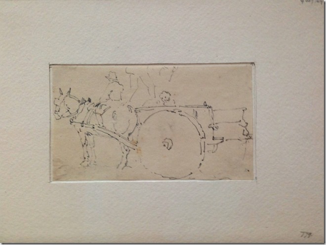
John Sell Cotman – not a name with which I was familiar – but a British artist of note from the early 19th century whose work is currently on show at the recently re-furbished and re-opened Leeds Art Gallery. Leeds has one of the largest collections of his work, which includes numerous watercolours and drawings depicting the Yorkshire ‘landscape’ of the time; and they have just completed a major cataloguing and digitising project. Their collection is now available online, with supporting information, here. Of interest to me, in the context of these studies, was the inclusion of numerous, mainly graphite, drawings and, in particular, dozens of mounted sketches from his sketchbooks. Many of these, see above, were tiny, rapidly-made drawings, capturing a figure, scene, shape, moment, or whatever – simple but well-practised lines that recorded something he might use later, I guess. And (not an original thought, I admit) one is immediately tempted to compare these with the myriad phone-based ‘captures’ of moments in our lives (see above!) that most of us make today. Look at the dog, top-left, and the simple composition bottom-left – ‘instagrams’ from around 200 years ago, finally ‘shared’ by Leeds Art Gallery.

Of course, there is a key difference (at least one, if not more) – Cotman’s fingers held the pencil/graphite that made these simple marks, based on what his eyes saw; and it’s hard not to regard that as something more personal, visceral perhaps, than touching the phone screen. One is drawn back, maybe, to that notion of a direct link from the unconscious mind through to these marks on the paper. Then again, it is the 21st century educated me, embryonic drawing student, standing in front of the mounted sketch who is contemplating such a connection. For Cotman, these were quite likely something much more practical, a gathering of material from which he might make further work – drawing as an intermediary process, maybe not a great deal more significant than the touching of the phone screen. Here is one, for example, which displays just those characteristics.

IMG_0808

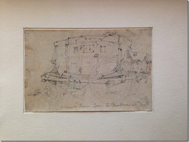
This sketch of the ‘Diligence from Caen to Honfleur’ includes notes to aid a future development of the subject – ‘green’ on the door and ‘12 spokes’ on the wheel. That doesn’t stop it having some ‘presence’ though. Familiar with both Caen and Honfleur, I am taken back to a time when there was no motorway or Pont du Normandie but a six horse carriage by which to make the journey. And I’m perhaps taken back there more powerfully by Cotman’s simple marks made hurriedly at the time, than I would be by a fully-developed watercolour painted weeks later in his studio – drawing as an expressive and direct link to the unconscious eye.

At a practical level, those simple rapid marks also speak to my embryonic drawing self as a lesson in sketching. My confidence in the ‘quick capture’ has been growing, certainly, but it is helpful to have the opportunity to look back 200 years to this accomplished artist’s sketchbook. I would recommend a visit to this exhibition, if only for that purpose.

IMG_0809

Nicola Tyson–‘Beyond the Trace’

IMG_0789

I was able to pay a brief visit to this exhibition at Drawing Room gallery in London, last Saturday. It isn’t the easiest place to find and, fitting the visit into an already busy day, I subjected myself to a flat out march of over a mile each way, to and from the underground station on a gloomy, muggy afternoon. So, not the best context for looking at art – but it was well worth it. It’s my first visit to a drawing exhibition since becoming a drawing student and, inevitably, I found myself looking through different eyes!

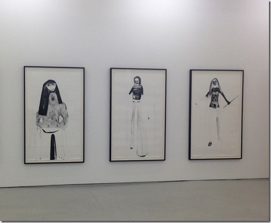
Drawing Room’s main space is the proverbial ‘white cube’ and Nicola Tyson’s large-scale drawings seemed appropriate in the high-ceilinged room. Scale is significant – many of the works, such as those illustrated above, are life size. A few months ago, I saw a Deanna Petherbridge exhibition at the Whitworth, Manchester; and again, the scale was big. At my early stage, drawing has still felt like something that happens at a small, intimate scale (though I have ventured as far as A2 now!) and so this was the first ‘lesson’ from the exhibition, even as I entered the room.

In the context of an earlier exercise in this module, these are drawings formed from ‘expressive’ lines and shapes – particularly lines. Quoting the accompanying documentation “Tyson’s drawings are intuitive; by working fast, the hand takes the lead, providing the spontaneity she requires to be surprised and unnerved by what unfolds”. They certainly appear that way, having something of a childlike quality whilst also emanating a degree of sophistication. There could be a temptation to fall into the ‘I could do that’ response until the detail and, often, the gaze suggests something other; or a hint of humour signifies intention that wasn’t immediately obvious. This is, perhaps, drawing from the unconscious – not from memory or from observation. She says that she sometimes begins a drawing with her eyes closed.

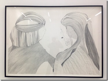
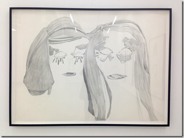
The scale and the expressive lines mean that the large drawings have a real presence; but then, as a drawing student, I wanted to look at the detail. Tyson says that, once the spontaneous hand has created the form and an image suggests itself, she begins to build the detail – shading and shadows – sometimes lightly, sometimes heavily, with graphite or ink pen. At this stage in my own development, the graphite interested me most. These are two new drawings, in graphite, each on a large scale (132 x 183 cm), The Secret top and The Selfie below. As I say, it was especially useful for me to be able to look at the detail of those large shaded areas, painstakingly built up with (I assume) graphite stick. At a distance (and on the immediate scale of these photographs – apologies for the unavoidable reflections, by the way) there is a sense that these are monochromatic watercolours or pale ink drawings.

IMG_0791IMG_0792

So, my immediate interest was in form and process; this was, perhaps, my main reason for making the effort to visit the exhibition. But, turning to the images themselves, what did I make of them. Truthfully, not a great deal beyond their obvious expressiveness. I have the accompanying booklet with essays about her work, where Drawing Room Director, Mary Doyle, says that Tyson is interested in “… re-imagining the female body to describe what it feels like to be contained within that body …”. At an extremely superficial level, that maybe excludes me from relating directly to the ‘subject matter’ of the work! I wasn’t familiar with her work before and I was in the gallery for no more than 30 minutes, so I am hardly doing justice by attempting too much in the way of in-depth analysis. The form and the process will be enough for me to take away, I think.

The question that lingers most significantly in my reflections – both in relation to the the work itself and to what I can learn from the visit – is this. Is it possible to be meaningfully expressive, in a manner comparable to Nicola Tyson, without first learning more traditional drawing skills? Or indeed, might it actually work in an opposing direction? To what extent does learning traditional drawing skills mitigate against spontaneity and expressiveness? Those are not questions with straightforward answers and certainly not right/wrong answers. Rather, these are open questions that, potentially, one can explore in one’s work. The most inspiring aspect of this type of visit, for me, is the ‘permission’ that I feel it gives me to be experimental and explorative in what I do. It is right and proper to test the boundaries, such as they exist, and I hope I can allow myself the freedom to be expressive.